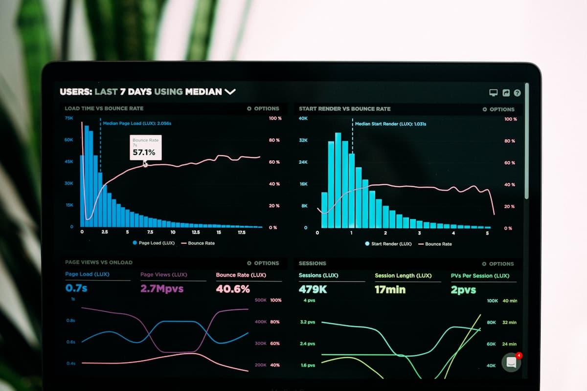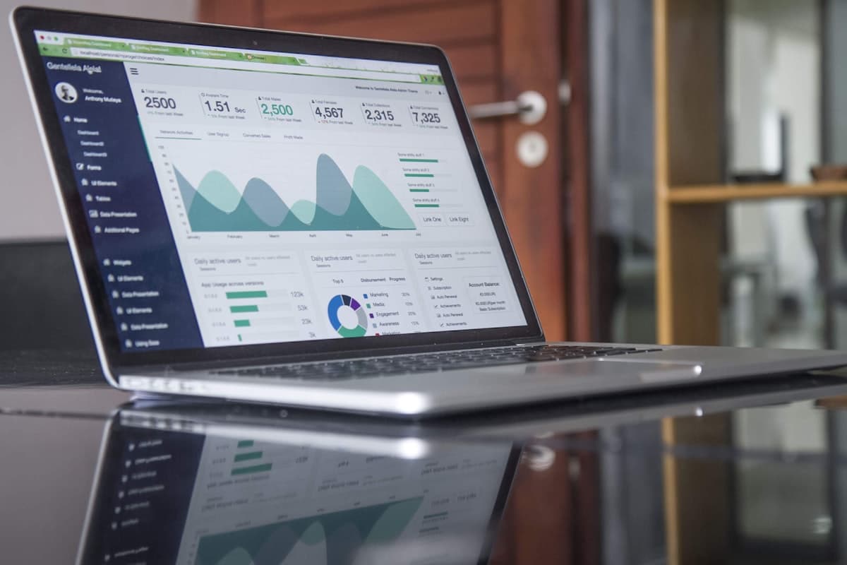
Most admin dashboards are designed poorly. They are cluttered with colorful charts, hundreds of metrics, and complex sidebars that look impressive in a sales demo but are practically useless to an operator.
A truly useful dashboard is not a data dump. It is a decision-support tool. When an operator or founder logs in, they shouldn't have to spend 15 minutes filtering tables or calculating averages. A good dashboard answers three fundamental questions within five seconds:
This is the baseline status. What are the key metrics today? Are sales up or down? How many active orders do we have? How many drivers are on the road? Display these as simple, high-contrast KPI cards with quick delta indicators (e.g., +12% compared to last week). Avoid complex gauges; use numbers.
A good dashboard surfaces problems before they become disasters. If an order is delayed, a payment has failed, or a server is down, it should be front and center. By highlighting exceptions (e.g., "3 orders delayed", "2 invoices overdue"), you allow the user to immediately drill down and fix the issues, rather than searching through lists manually.
Every piece of data on a dashboard should lead directly to an action. If a dashboard shows that a delivery is delayed, there should be a button right next to it to "Reassign Driver" or "Message Customer." Data without actions is noise.

Founder & Product Lead at SortedCore